Creative ideas
Gothic junk journal layouts: dark pages with room to write
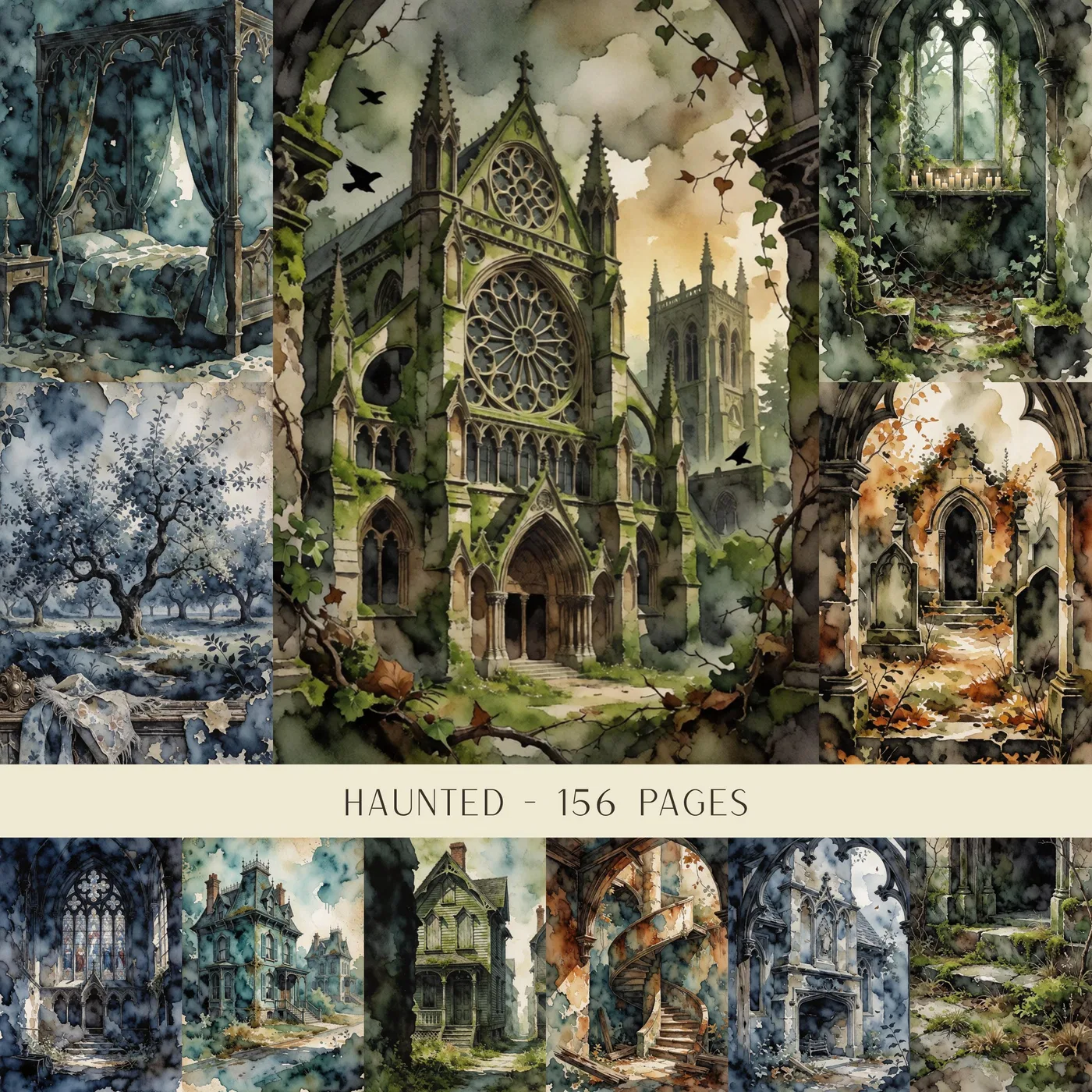
A dark journal spread does not have to be crowded or difficult to write on. Gothic architecture, distressed textures and a few carefully placed details can establish the mood while a quiet writing panel keeps the page useful. Think in contrasts: dark and light, intricate and plain, hidden and visible.
Build contrast into the page
Start with one atmospheric background and a lighter piece of paper for your writing. Cream, pale gray or a subdued parchment tone can work against a dark architectural design. Keep the lighter panel large enough for the words you actually want to add.
Choose one accent color, such as burgundy, antique gold or muted violet. Repeat it sparingly in a tab, label or small paper strip. Using every decorative detail at once can hide the background that first caught your attention.
Layout one: a mansion-inspired spread
Let an architectural motif occupy one side of the spread. On the facing page, use a quiet writing panel with a narrow strip of the same background along its edge. This connects the pages without repeating the full image.
Position a date label or short title near the writing panel rather than over the most detailed part of the architecture. If the image crosses a fold, test a paper mock-up first: a doorway or window can disappear into the gutter. Use an excerpt from your own writing, or a public-domain text you have checked, rather than assuming any found quotation is free to reproduce.
Layout two: a hidden-letter pocket
Fold a plain sheet into a small letter and size a pocket around it. Add a dark patterned front, then attach the pocket along its sides and bottom. Allow space for the adhesive seams and test the opening after the glue has dried.
Write a fictional letter, a memory or a question you want to return to later. A paper seal or printed emblem can suggest an old correspondence without the bulk of a wax seal. Keep protruding decorations away from the spine and page edges.
Use fewer layers with more purpose
Try just three visible layers: the background, the writing panel and one focal detail. Tear an edge or offset a small frame to add texture. Step back before adding anything else; the empty space is part of the atmosphere, not a gap you must fill.
If your focal element is busy, keep the surrounding pattern small or subdued. A single repeated shape can connect the spread more clearly than several unrelated ornaments.
Check dark areas with a test print
Deep tones can print differently from the screen and may use more ink than a pale background. Test one page using the paper type and quality setting recommended for your printer. Look for lost detail in shadows before printing a larger set.
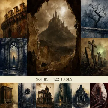
Check both the artwork preview and the written file details on Etsy. A cover image shows the mood of a product; it is not a guarantee that every visible element is supplied as an individually cut-out embellishment. Follow the listing’s licence for any finished project you intend to sell.
Papers to explore
These are digital product previews. Open a design for its details, then visit Etsy for purchase and download information.
Prepared for Junk Journal Diary. Project suggestions are starting points, not tested product specifications. Follow your printer and adhesive instructions.
← Back to journal & guides